Sen no Rikyū understood friction better than anyone who has ever opened Figma
I still remember the sound before anything else.
I was maybe eight years old, sitting on my knees in my grandmother’s tea room, already too long, already starting to ache. Watching her hands move through a sequence I didn’t understand. She was wearing a kimono. This is where things get strange in memory: she looked like my grandmother, but she moved as if someone else entirely. Unhurried. Exact. Each motion was completed before the next one began. The room was spare, not small in the way of an overlooked corner, but precise, the way a sentence is precise when every unnecessary word has been removed. And yet, precisely because of that precision, it felt enormous.
Then arrived the sound I’ve never forgotten. The ladle touched the iron kettle as she scooped the hot water. A soft, resonant knock. Somewhere in my personal list of favorite sounds in the world. There is no English word for what this sound does to a person. It bypasses the thinking mind entirely and arrives in the chest, spreading outward like warmth. It doesn’t ask for your notice. It simply arrives.
I was concentrating so hard on the etiquette of how to receive the bowl, which way to rotate it, and when to bow, that I almost missed what was actually happening. The whole ritual was designed to slow me down enough to notice things I would have otherwise walked straight past.
I didn’t have the vocabulary for it then. Now I think I do: this was a user experience. One of the most deliberately designed interactions I have ever been inside.
The 茶室 (Chashitsu) as a Design System
The path to Hakuundo Chaen in Hakone does not welcome you. It asks something of you first.
You descend steep stone steps. The kind that requires attention, that doesn’t let you look at your phone, and the sound of the street falls away. The passage appears less like a garden path and more like a threshold between states of being. There is no accessibility here, and I mean that without irony: the place was not built to be fallen into. You arrive because you chose to.
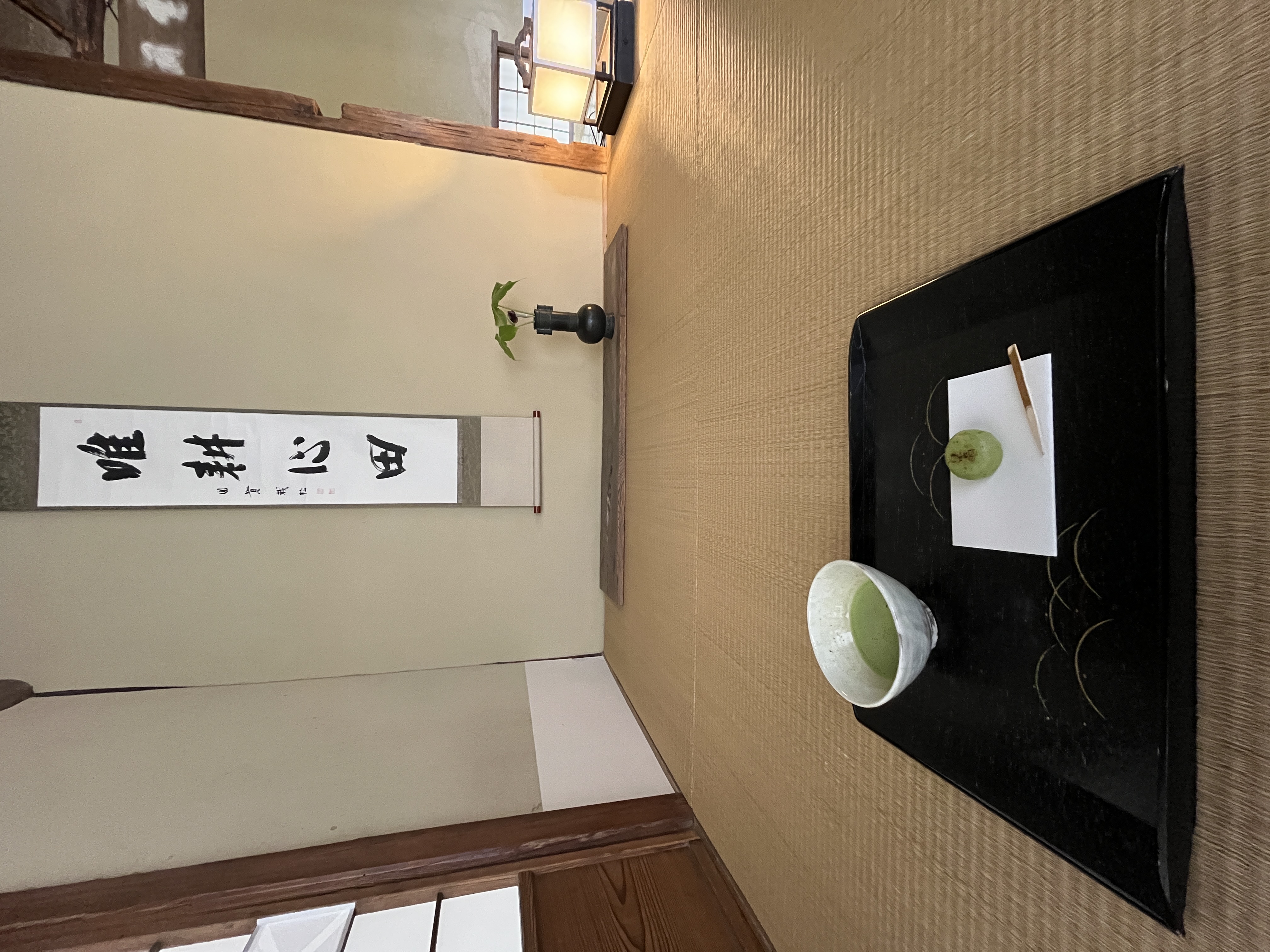
The roji, the narrow gravel path to the tea room, is flanked by stone covered with moss and low-tended plants. Nothing about it overstimulates. Everything in the visual field seems to be precisely where it should be, which is different from being decorative. Walking it, I felt, for a moment, like a natural element rather than a visitor, part of the landscape rather than a spectator of it. The wooden floor creaks underfoot, and the sound tells you something: that this space is not permanent, that it exists in time, that it is aging alongside you.
Within the stillness, a kakei, a length of bamboo from which water trickles in a thin, continuous stream into a stone basin below, provides the only sound that isn’t natural. Not a dramatic gesture like the shishi-odoshi’s periodic knock, but something quieter and more constant: a presence rather than a punctuation. Birds answer it anyway. The effect is not peaceful background noise. It is more like a score that clears the mind of its usual clutter, leaving it open.
Inside the tea room, the ceiling is supported by gnarled, hand-hewn timber beams. The materials are ancient and irregular as they are supposed to be. The confectionery is placed before you before tea. Intentionally. Had something elaborate appeared on that dish, something that invited to be noticed for its own sake, it would have become noise. A disruption to an environment that is doing very careful work. The modest sweetness is an intentional choice. It disappears into the experience in exactly the right way.
Nothing in the room is symmetrical. The wood beams are not straight. The materials, ancient timber reclaimed from elsewhere, stone worn by decades of rain, resist the easy comfort of uniformity. This is a deliberate aesthetic choice rooted in the principle of wabi (侘び) : the beauty that lives within imperfection, in rusticity, in the mark of time.
But set aside the philosophy briefly and consider what this space is actually doing to the person inside it.
The path forces a transition. By the time you reach the tatami floor, you have already shed something: the pace of the street, the noise of your own thoughts, the posture you hold in public. The environment has quietly changed your state before you’ve done anything at all.
The room contains almost nothing. A hanging scroll. A single branch in a narrow vase, spare rather than floral, present rather than decorative. The iron kettle. And precisely because the room contains almost nothing, every element in it becomes visible. You notice the scroll. You see the shadow it casts on the wall behind it. You read the four characters brushed across it: 唯耕心田. Cultivate only the field of the mind. You start asking, even if only to yourself, why this and not something else?
This is the paradox at the heart of the tea ceremony’s design: restraint creates attention. Emptiness creates presence. Friction, the unfamiliar posture on your knees, the enforced sequence of sweet-then-bitter, bowl-before-conversation, generates the very engagement the ritual is trying to produce.
Remove the friction, and you remove the meaning.
What Apple Got Right (And Then Forgot)
In 2013, Apple published its Human Interface Guidelines around three principles: Clarity, Deference, and Depth.
Read them carefully, and they sound almost Zen. The interface defers. The content leads. The hierarchy is felt, not explained. Steve Jobs was famously interested in Zen Buddhism, and there is a line, admittedly a generous one, between “Deference” in the HIG and ma (間), the Japanese concept of negative space that gives surrounding forms their meaning.
But the philosophy and the product have been moving in opposite directions for years.
The iOS of today is not deferential. It is hungry. Notification badges pile up on every app icon, each one an unresolved demand on your attention. Screen Time, a feature explicitly built to help you use your phone less, is buried at least three taps deep, while the apps it’s meant to limit sit one tap away, in a grid organized around their interests, not yours. The principles said deference. The implementation said capture.
This drift was not a simple failure of vision. It was a concession to the arithmetic of the attention economy. Apple’s services revenue now rivals its hardware margin. Google’s entire business model runs on time spent inside its interfaces. Both companies faced the same pressure: turn the tool into a destination. The design philosophy remained on the page. The product went somewhere else.
The tea room does the opposite. It hides what you don’t need right now. It sequences what you do need. It trusts that you can handle not seeing everything at once.
The Language Gap Between Tea and Tech
There is a vocabulary problem in interaction design, and it’s worth naming directly.
UX has a rich language for reducing friction: onboarding flows, progressive disclosure, zero-state design, and inline validation. These are techniques for making first encounters smoother and faster.
But there is almost no language for designing friction intentionally. For understanding which frictions are doing cognitive work, holding the user just long enough to ensure genuine engagement, and which are merely obstacles.
The field has touched on this. Cognitive psychology introduced “Desirable Difficulties”, the idea that certain forms of resistance improve long-term retention and understanding. HCI research has explored “Seamful Design,” arguing that exposing a system’s seams rather than hiding them can increase user awareness and agency. These are real and useful ideas.
But I haven’t found a framework that treats intentional friction as a complete design vocabulary, or one derived from a tea room rather than a laboratory.
The tea ceremony, refined over 400 years, is essentially a manual for exactly this. Every step that feels like an obstacle is an obstacle. But it is an obstacle that produces something: attention, presence, the particular quality of care you bring to an action you cannot rush.
Sen no Rikyū, the 16th-century tea master who formalized much of what we now call chado, described the philosophy as ichi-go ichi-e (一期一会): this gathering, this moment, will never happen again.
I find this almost unbearably human. In a world where interfaces are designed to be flawless and perfectly repeatable, where the goal is a consistent experience across every session, every device, every user, here is a 400-year-old design philosophy that makes non-repeatability its central feature. Impermanence is not a constraint to engineer around. It is the point. Every bowl of tea is unrepeatable because every person, every season, every quality of daylight is unrepeatable. The ceremony honors that.
Compare this with the direction modern interface design has taken.
Microsoft Copilot reduces the mental effort of every task: drafting the email, summarizing the meeting, and generating the slide. Genuinely useful. But consider what happens to a person’s relationship with their own work when the intermediate steps, the drafting, the searching, the weighing of words, are consistently removed. Those steps were not pure friction. Some of them were where comprehension happened. Some of them were where the work became yours. If the goal is to remove humans from their work as efficiently as possible, this is the correct design direction. Whether that is actually the goal is a question worth asking plainly.
Google’s AI Overviews answer the question before you’ve had a chance to develop one. Efficient. Also, quietly, a context-removal machine.
The tea ceremony’s 400-year-old insight is that how matters as much as what. Not always. Not for every task. But for the ones where you want the result to mean something to the person who arrived at it, how matters.
A Framework, Borrowed From a Tea Room
This is not an argument against efficiency. It is an argument for discernment.
Here is a framework I want to propose, one I believe hasn’t been articulated quite this way before in interaction design:
Four types of friction. Only one is a failure.
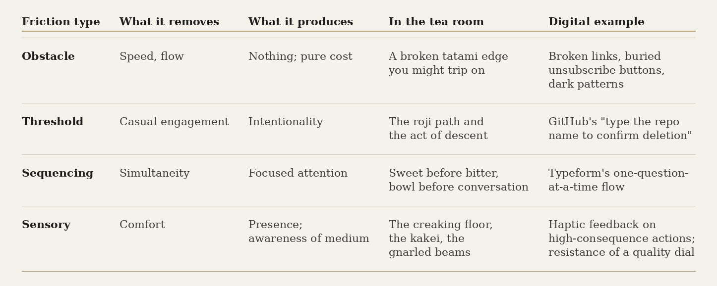
Obstacle friction is always a failure. The other three are tools, and the question is whether you’re using them consciously or not.
Threshold friction is the roji garden path. You cannot stumble into a tea ceremony accidentally. The environment guarantees that arrival is a choice.
The traditional tea room takes this further with the nijiriguchi, a crawling entrance so low that all guests, regardless of rank, must bow to enter. I should note: the tea room at Hakuundo Chaen in Hakone doesn’t have one. But the principle operates throughout the approach regardless. The nijiriguchi is Seamful Design in its purest physical form. It doesn’t hide the boundary between outside and inside; it insists on it. The seam is the feature. The moment of transition is designed into your body, not just your mind.
In digital interfaces, GitHub’s confirmation dialog for deleting a repository performs a version of this. You must type the repository name exactly. Not click confirm, not toggle a switch, but type it. A minor act of recollection that forces a conscious pause before an irreversible action. The friction is not a UX failure that escaped QA. It is a threshold, doing exactly the work a threshold should do.
Sequencing friction removes simultaneity and installs attention. In the tea room: sweet before bitter, arrival before preparation, observation before participation. The sequence is not arbitrary. Each step creates the conditions for the next one to land properly. Typeform’s one-question-at-a-time flow applies the same logic digitally. By refusing to show you the full form, it turns data collection into something closer to a conversation. Not being able to scan ahead, not being able to fill it out of order, that friction is the mechanism by which engagement is produced.
Sensory friction is where tea and technology part ways most honestly. The tea room uses all five senses to shift your state: the creak of the floor, the warmth of the bowl, the smell of the tatami, the bitterness of the tea, the asymmetry that makes your eyes slow down and actually look. Digital interfaces work almost entirely with vision, and occasionally with sound and haptic feedback. That is a real asymmetry, and I don’t want to paper over it. A screen cannot do what a creaking floor does.
But within those constraints, the principle still holds. The physical resistance of a high-end camera dial, the slight friction that makes each stop feel intentional, is sensory friction doing cognitive work. The haptic response of the iPhone’s Action Button is a small version of the same thing: a signal to the body that something consequential just happened. When Apple removed the physical home button, they removed a piece of sensory friction that had been quietly anchoring the user’s sense of where they were. The interface became slightly more seamless and, in a small but real way, slightly less present.
Good interface design probably needs all four. The question isn’t whether to add friction. It’s knowing which kind you’re deploying, and why.
This is where Apple’s original HIG was genuinely onto something. “Depth”, the idea that visual layers convey hierarchy, is a form of sequencing friction. Not everything visible at once. When the original iPhone launched, the physics-based scrolling, the rubber-band bounce at the list’s edge, the way folders opened with a sense of gravity, these were material metaphors teaching the user how the system behaved. As the visual design flattened and the feature surface expanded, that sense of depth, in the philosophical sense, thinned.
What My Grandmother Knew That Figma Doesn’t
The day at my grandmother’s tea room, I was mostly worried about getting the etiquette wrong. I rotated the bowl the right number of times. I bowed at what I hoped were the right moments. I got through it without obvious embarrassment.
What I missed, and only understood much later, was that the ceremony was designed not for my comfort but for my awakening, not in any mystical sense, just the ordinary, underrated experience of being genuinely present in a room, with another person, around a single bowl of tea.
My grandmother moved through that space as she had been doing it for decades. What struck me, and what I’ve been thinking about since Hakone, is that her fluency wasn’t merely technical. She wasn’t just executing a sequence correctly. She was inside the experience in a way that no procedural knowledge alone could produce. The kimono-wearing woman in that room was, in some real sense, a different person from the grandmother I knew outside it. The ritual had made her into something. It does that, apparently, over time.
This is what the tea ceremony ultimately trains: not behavior, but attention. The protocol is the scaffolding. What it builds across years of practice, and also in a single quiet afternoon in a room with almost nothing in it, is a capacity to notice.
The best interfaces I have encountered do something analogous. They don’t only make tasks easier. They make the person using them more capable, more present, more aware of what they’re actually doing. They have a considered point of view about the user’s attention, and they spend it carefully.
Most interfaces today are exceptionally good at making tasks easier. They are not especially interested in what happens to your attention in the process.
The Real Question
I don’t think we should design products like tea ceremonies. That would be nostalgic, and nostalgia is not an argument.
But the tea ritual reveals something that the current direction of interface design, toward anticipatory completion and systems that act before you ask, is structurally unable to account for.
The experience Rikyū spent his life refining was not about making tea more efficient. It was trying to make it meaningful. And meaning requires a certain amount of resistance, not because difficulty is virtuous, but because some things only become visible when you slow down enough to look.
There is a word in Japanese with no clean English equivalent: mitate (見立て). It means seeing one thing as another, a weathered stone as a mountain, a plain bowl as an act of hospitality. It is a cultivated form of attention. It cannot be automated. It is, in a sense, the capacity that carefully designed friction, threshold, sequencing, and sensory, was built to develop in a person.
The next decade will produce interfaces capable of doing almost everything for us. The question I keep returning to is not whether they will.
It’s what kind of attention we’ll have left, and what we’ll be able to see with it.
FAQ
What is the connection between the Japanese tea ceremony and UX design? A:The tea ceremony (chado) is one of the most deliberately designed human experiences in history, a 400-year-old system that uses sequencing, spatial restraint, material choice, and intentional friction to produce presence and attention. Modern interface design can learn from its underlying logic: that removing all friction doesn’t always improve an experience. Sometimes it destroys it.
What are the four types of friction in the framework? A:Obstacle friction is pure cost, broken flows, dark patterns, and is always a failure. Threshold friction ensures intentionality before consequential action. Sequencing friction removes simultaneity and creates focused attention, one step at a time. Sensory friction produces presence, an awareness of the medium through the body, not just the eyes. Good design uses the last three deliberately.
What is the nijiriguchi and why does it matter for design? A:The nijiriguchi is the traditional crawling entrance to a tea room, so low that every guest must bow to enter, regardless of rank. It is a physical example of Seamful Design: rather than hiding the threshold between outside and inside, it insists on it. The boundary is made visceral. In digital interfaces, deliberate confirmation steps before irreversible actions perform a similar function. They are thresholds, not obstacles.
How do Apple’s Human Interface Guidelines relate to Japanese design philosophy? A:Apple’s original HIG principles, Clarity, Deference, Depth, resonate with Japanese concepts like ma (negative space) and wabi (beauty in restraint). But commercial pressure from the attention economy has pushed iOS toward engagement capture, in direct contradiction of the stated philosophy of deference.
What is ichi-go ichi-e (一期一会)? A:“One time, one meeting.” The idea that this gathering, this moment, will never happen again. It treats non-repeatability not as a limitation but as the source of an experience’s meaning, in direct tension with modern design’s emphasis on seamless, consistent repeatability across every session and device.
What is mitate (見立て)? A:The practice of seeing one thing as another, a mossy stone as a mountain, a simple bowl as an act of hospitality. A cultivated form of attention that cannot be automated. In the context of this article, what engagement with intentional friction can develop in a person over time.
Further Reading
On the philosophy of the tea ceremony
- Sen no Sōshitsu XV, The Japanese Way of Tea: From Its Origins in China to Sen Rikyū (University of Hawaii Press, 1998) — the definitive English-language account of chado’s philosophical development
- Kakuzo Okakura, The Book of Tea (1906) — still the most elegant introduction to tea aesthetics for Western readers; free online
On intentional friction and learning
- Robert A. Bjork & Elizabeth L. Bjork, “Making Things Hard on Yourself, But in a Good Way: Creating Desirable Difficulties to Enhance Learning” (2011) — the foundational paper on why resistance improves retention and understanding
On Seamful Design
- Matthew Chalmers, Ian MacColl & Marek Bell, “Seamful Design: Showing the Seams in Wearable Computing” (IEE Eurowearable, 2003) — the paper that named the idea that hiding a system’s seams is not always the right design choice
- Matthew Chalmers & Areti Galani, “Seamful Interweaving: Heterogeneity in the Theory and Design of Interactive Systems” (ACM DIS, 2004)
On Apple’s design philosophy and its drift
- Apple, Human Interface Guidelines — read the principles, then use your phone for an hour
- Apple, iOS Human Interface Guidelines (2013, archived) — the original Clarity / Deference / Depth, as published with iOS 7
On wabi-sabi and Japanese aesthetics
- Leonard Koren, Wabi-Sabi for Artists, Designers, Poets & Philosophers (Imperfect Publishing, 1994) — short, essential, and still the best English-language entry point
- Taishi Okano, “Wabi-Sabi in the Age of Algorithms” — engawa #5, a companion piece to this essay
Taishi Okano writes about the intersection of technology, craft, and culture from New York and Tokyo. engawa is where he works things out.